
is a mobile and web platform that helps buyers to discover and purchase original artworks directly from artists.
It also helps artists stay up-to-date with the latest news, exhibitions, and updates from their colleagues. It is used by artists to grow their audience and develop careers.
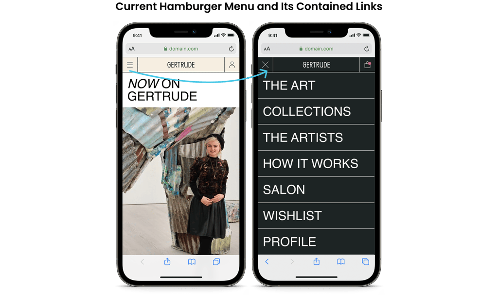
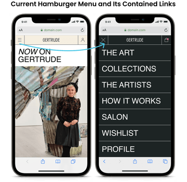
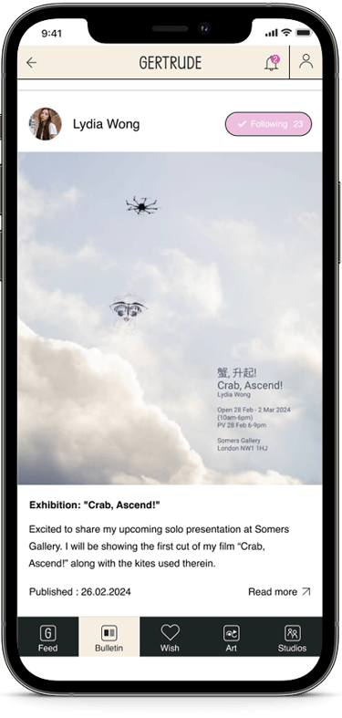
Improving the navigation experience in the Gertrude Art App
Case Study
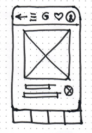
Initially, the app featured a left-side pop-up navigation menu, accessible via a hamburger icon. While functional, this setup limited visibility into the app’s core features and made it harder for users to seamlessly explore content.
User Problems
Business Problems
The hamburger menu — which had been placed on the left, was removed. At the same time happened the browser’s back button elimination. The app didn’t have its own back button, making it hard to return to previous screens.
The structure of the side menu was unclear, and users found it difficult to locate important sections like the Art or Artists.
Some labels were unclear for users, like Salon or Collections.
Users struggled to locate critical navigation tabs: Artists, Wishlist, and the Art section displaying all available artworks. This confusion in navigation directly impacted the user journey by:
Obstructing product discovery,
Reducing purchase intent,
Lowering conversion rates.
My Role
Project Duration
I was the UX/UI designer on this project, working closely with the CTO, developers, and CEO. I’ve done:
User research
Stakeholder interview
Low-fi prototypes
High-fi prototypes
September 2023 - January 2024
Discovery and Research
Problems revealed were grouped into findings:

Heuristic Evaluation
User Interviews
Stakeholder Opinion
I spoke with six active users - both artists and collectors.
Most of them said:
they often felt lost in the app.
They couldn’t find key features
often didn’t understand how to return to the main menu.
I conducted conversations with two key stakeholders. Both expressed concerns:
Lack of visual cues, leading to confusion and drop-offs,
Unlabeled icons,
Unclear page titles,
Missing navigation patterns.
To fully understand what was going wrong with the app’s navigation, I used these key research methods:
Solutions for problems:
I started by checking the app against best-practice usability rules. This revealed problems like:
No clear sign of where users were inside the app.
Icons without labels, which made them hard to understand.
Titles are unclear.
Inconsistent flow between screens due to absence of the back arrow.


Lack of identifing user’s orientation and localization in the app
Unlabeled and unclear icons and titles
Inconsistent navigation flow
The absence of a back arrow and unability to return
Introduced clear visual indicators
Added design elements (e.g. highlighted tabs or active state indicators) to help users understand their current location within the app.
Replaced vague titles with concise, meaningful ones to give better context
Restored and standardized the back arrow
Ensured every screen included a consistent and recognizable way to go back
The insights from the research confirmed the need for a comprehensive navigation redesign to improve both usability and business outcomes.
All these findings pointed in the same direction: navigation was a major barrier. It needed to be more intuitive, better organized, and clearly labeled.
Initial Ideas and Concepts
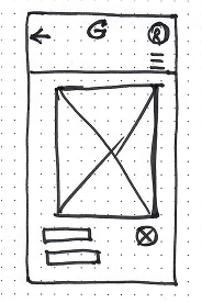


I began by exploring different navigation patterns using quick sketches and low-fidelity wireframes.
My goal was to find a structure that would support the app’s main tasks while making it easier for users to move around.
One idea I tested early was a bottom nav bar with 5 consistent tabs.
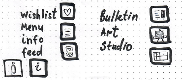
As a UX designer I should reveal the right tabs and icons for them.
An example of hand-drawing icons
I shared the wireframes with key users and team members:
They commented on icon clarity and overall layout.
Appreciated the new labels and how features were grouped more clearly.
Three changes from their feedback:
Added microcopy (short text labels) to help users understand the icons.
Adjusted the navigation order to highlight “Feed,” “Wish,” and “Art.”
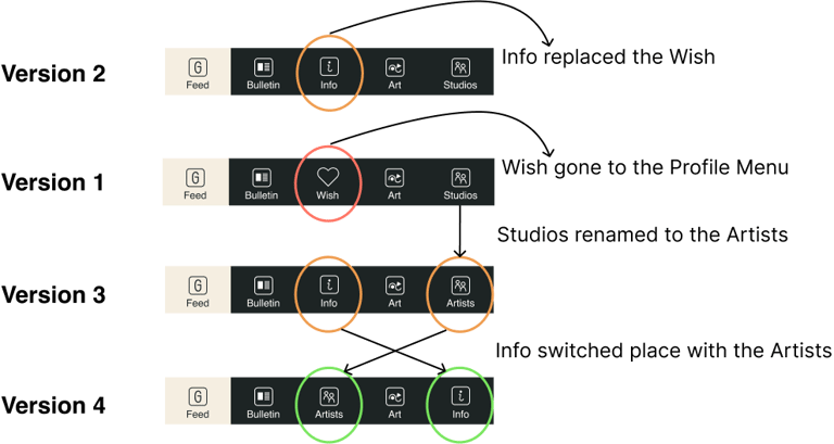
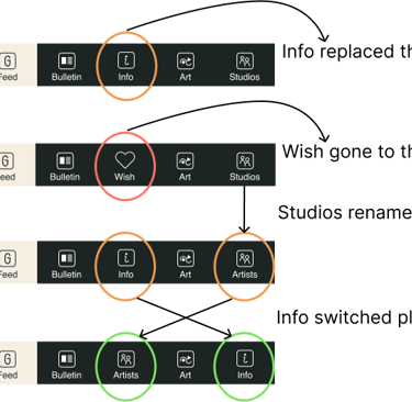
Changed the name of one button on the naw bar from “Studios” to “Artists”.
User Feedback and the Stakeholder Opinion
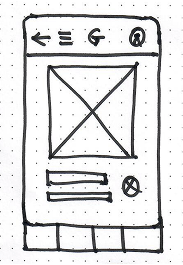
Using pen and paper, I built simple wireframes and tested them with three users to gather quick, honest feedback.
Early concepts focused on:
Making main categories easy to find (like Artworks and Studios).
Creating a consistent layout across mobile and tablet views.
Ensuring the navigation made sense on mobile and web platforms.
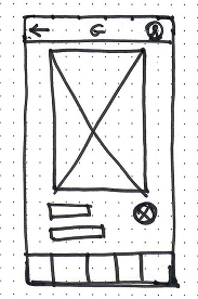
Iterations after rounds of design and testing
Other iterations included:
Restructuring the bottom tab bar to only 5 main sections, plus a central action.
Increasing contrast and touch target sizes for better accessibility.
Testing each version with users and reviewing it with stakeholders for continuous feedback.
For example, the navigation bar changed over time:
Initial version: Feed, Bulletin, Wish, Art, Studios
Iterative version: Feed, Bulletin, Info, Art, Artists
User Research
Methodology:
Usability testing involved user feedback sessions.
Users were asked to perform common tasks using both the old and new navigation systems.
We’ve received great feedback about the new app navigation compared to the web navigation.
Findings:
We made a hybrid application where the back button leads to the previously opened page. This confuses users because they expect the back button to work as it does in other applications, bringing them to the top level of the hierarchy.
User’s success stories:
Success stories from users highlight the positive impact of our new navigation system. Users have reported a more intuitive and enjoyable experience, with easier access to their favorite artworks and smoother transitions between sections. Many have praised the improved functionality, noting that it has significantly enhanced their overall engagement with the app.
The new navigation bar at the bottom makes everything so much easier to find. I love having the news feed right there when I open the app.
The back arrow at the top of the screen is confusing. I expect it to function like it does in other apps, taking me back to the list of artworks.


User A.N.
User G.B.
Reflections / What I Learned
This project was more than a redesign, it was a lesson in user-centered thinking and teamwork. Here’s what I learned:
Good UX starts with user research, not just UI improvements.
Clear communication is essential, especially when explaining design choices to non-designers.
Iterating in small steps, based on regular user input, leads to better long-term results.
If I had more time, I would also run an A/B test comparing two navigation versions to back up decisions with more data.
This case helped me grow, not just as a UX designer, but as a collaborator and decision-maker in a cross-functional team.
Explore
Portfolio
© 2025. All rights reserved.