E-Commerce in Motorisation:
UX Review of Autodoc.pl
Autodoc.pl is one of the largest online platforms for purchasing car parts and accessories in Europe. However, even in such a robust and established system, there is room for UX improvement.
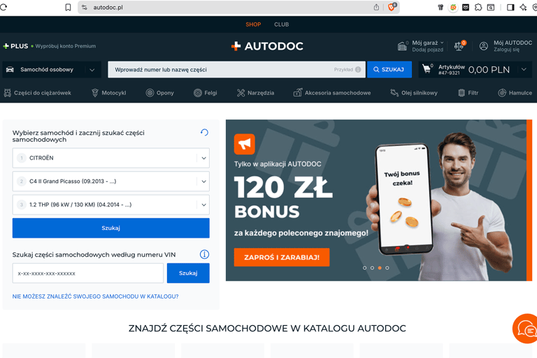
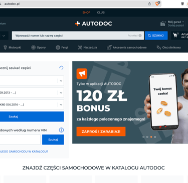
As a UX designer, I aim to showcase my ability to review and evaluate e-commerce platforms. This case study highlights opportunities where Autodoc.pl could simplify and optimize the user journey.
Introduction
My Goals
Issue 1: Cart Item Removal Interaction
Observation:
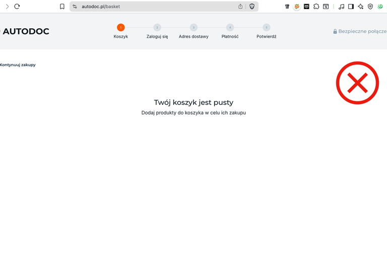
When a user removes an item from the cart, a pop-up window appears. This behavior feels like a technical glitch or an unintended system message rather than a clear, user-friendly interaction.
Why it’s a problem:
Pop-ups interrupt the user journey.
They signal “error” instead of normal system behavior.
They create friction in a moment that should be smooth and predictable.
Recommendation:
Replace the pop-up with an inline, friendly confirmation message, for example:
“Oops, your cart is empty. Let’s find something for your car!”
And nearby provide quick navigation links to main categories such as:
Brakes
Tires
Batteries
Oils & Fluids
Lighting. etc.
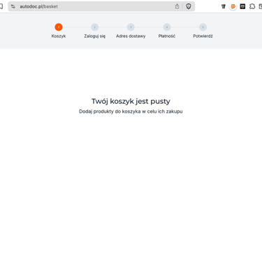
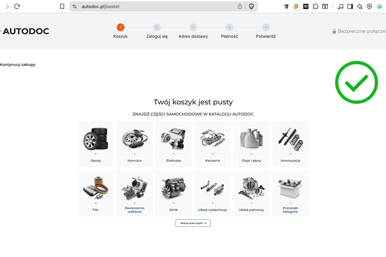

After
Before
Issue 2: Product Category Structure
Observation:
Speaking about product categories, the category system is visually heavy. The use of large photos distracts the user and slows down scanning.
Why it’s a problem:
Large polichromatic images add cognitive load.
Users may focus on the visuals instead of quickly identifying the needed product type.
Recommendation:
Use a simplified icon-based category navigation consistently. The platform already has well-designed, monochrome icons in the left drawer menu—these should replace the large photos across the interface for a cleaner, faster browsing experience.
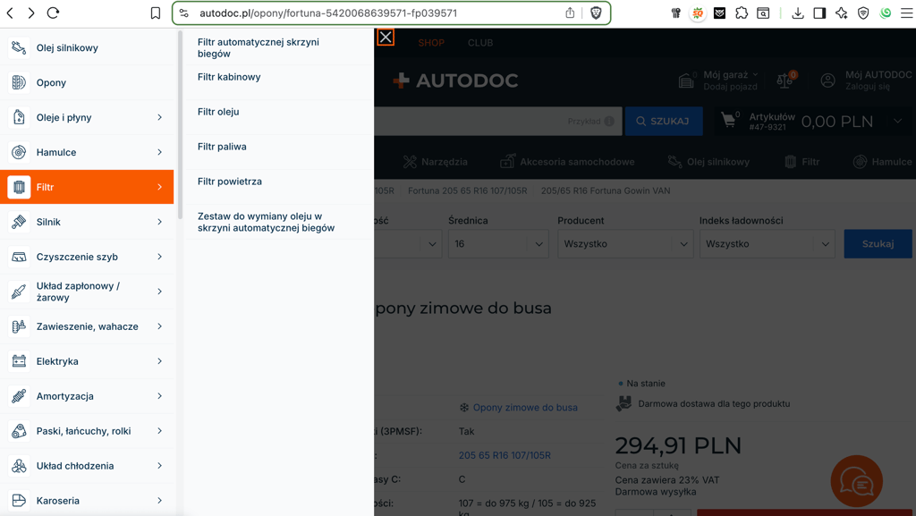
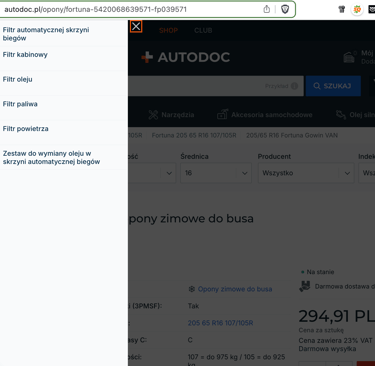
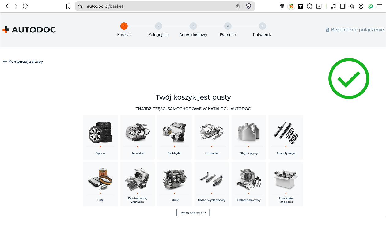
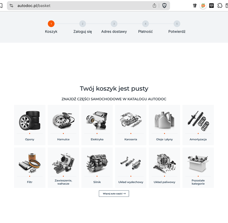
Like here:
Issue 3: Icon Recognition
Observation:
The category system is visually heavy. The use of large photos distracts the user and slows down scanning.
Why it’s a problem:
Large polichromatic images add cognitive load.
Users may focus on the visuals instead of quickly identifying the needed product type.
Recommendation:
Adopt a simplified icon-based category navigation (like the drawer menu on the left side of the site). Use monochrome, recognizable icons for clarity and consistency.




Issue 4: Color Palette
Observation:
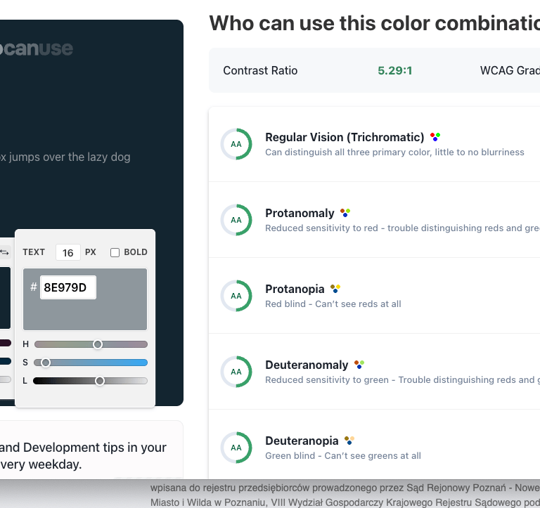
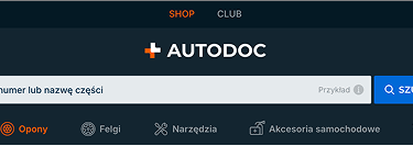
The platform has two color combination for header: dark navy #132530 and dark orange #F85A00, second is dark navy #132530 and light grey #8E979D.
Both of them are distinctive and creates low contrast in some areas and reduces readability.
Why it’s a problem:
Poor contrast harms accessibility.
Dark tones may overwhelm users during extended browsing sessions.
Text may still feel “washed out” on smaller screens or under lower brightness.
Users with mild visual impairments or older displays could struggle with legibility.
Recommendation:
Increase contrast by darkening text (closer to pure black #000000) or lightening the grey background.
Use the grey #8E979D more sparingly (for borders, icons, inactive states), while keeping text on higher-contrast backgrounds.
Consider a more neutral light palette (e.g., off-white #F4F4F4) to balance the dark navy.
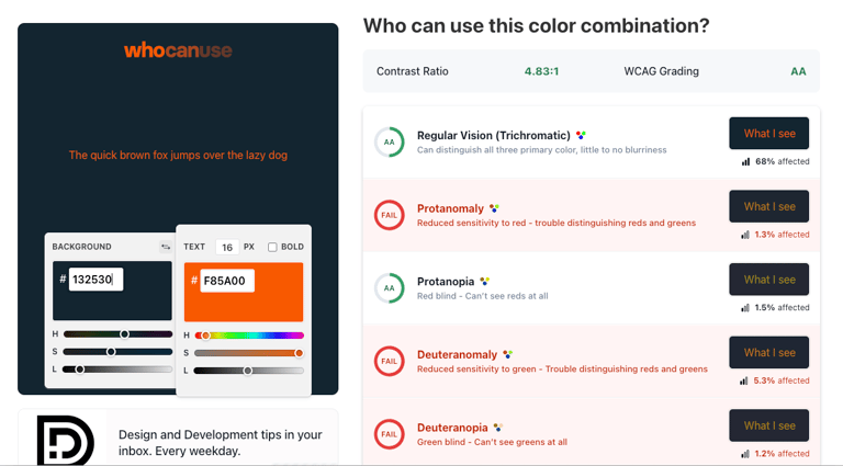
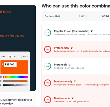
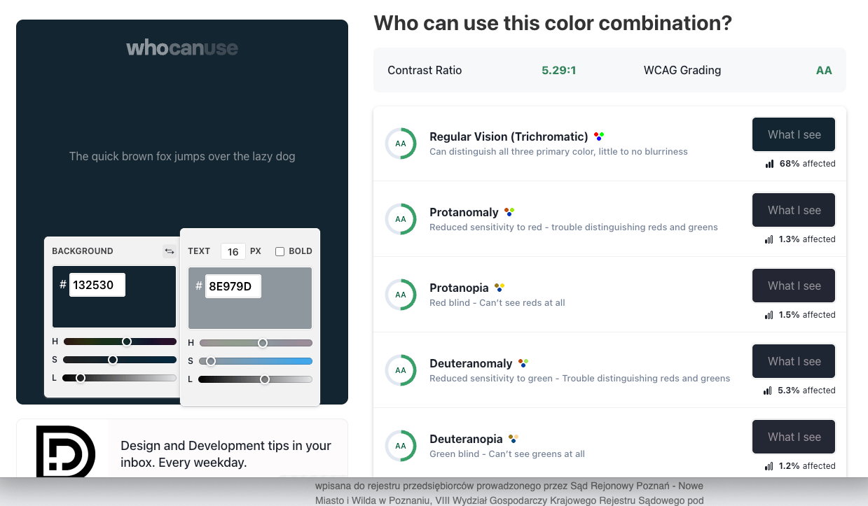

Contrast ratio analysis (using whocanuse.com)
Navy #132530 on grey #8E979D has a contrast ratio of 5.29:1.
According to WCAG accessibility standards:
AA level: requires 4.5:1 for normal text and 3:1 for large text → this passes.
AAA level: requires 7:1 for normal text and 4.5:1 for large text → this fails.
Conclusion
Consistency matters: Using the same icon style and structure across the platform simplifies navigation and strengthens visual hierarchy.
Clarity builds trust: Replacing disruptive pop-ups with inline messages creates a smoother and more reliable shopping flow.
Accessibility enhances usability: Improving color contrast and pairing icons with text ensures better readability for all users.
Small changes, big impact: Even minor visual and interaction adjustments can elevate user comfort and make the e-commerce experience feel effortless.